Introduction
Hey everyone, this is Nupur Baghel and Paavini Nanda, from the team “101 Days of Summer”. Both of us are computer engineering undergraduate students from New Delhi, India. We were involved with Servo this summer under the Rails Girls Summer of Code program and spent an amazing 3 months implementing functionalities to support responsive images in Servo <3
A little about RGSoC
RGSoC is an initiative which helps in introducing women to open source in a team consisting of a pair. It is a fully paid three-months internship program. To be a part of the it, one needs to have at least two coaches which you have to find, a supervisor which RGSoC provides and a mentor who is related to the organisation. While searching for a project to work on, Servo seemed to be a great project which could give us hands-on experience in Rust. As complete beginners to Rust, we thought it would be a tough call to work on the project but with the help of Josh, we were able to complete our project.
What are Responsive Images?
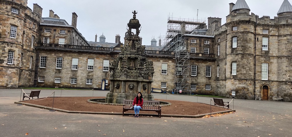
Imagine you want to open a website containing a wide high resolution image in your desktop. Since your desktop is wide, you will be clearly able to view the entire image. Also, owing to the well support of pixel resolution in your laptop, you will be happy loading the image completely….But now consider a different situation, where you want to open the same website in your small-sized cell phone. There are 2 problems here-
- Your image size gets scaled down to fit the new screen size. But you may now want a different image instead of the older one, which emphasises just the main portion of the original image. (For eg, a cropped image with just the center part)


Solution: Responsive images solves this by supplying a list of image sources in the sizes attribute of image element so that we can know which image is to be displayed depending on screen sizes.
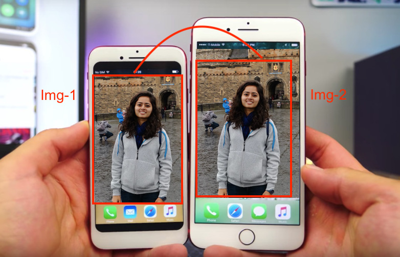
- Considering the above solution is implemented and you have a list of images, we would now want to load only the specific lower density image which matches the size of the phone and discard downloading the other images to waste unnecessary bandwidth. Thus if there is phone 1 and phone 2 with different screen sizes we would be loading 2 different images. Illustrated below :

Solution: For this, we have algorithms which match the size of the device to determine the required image. Incase our device width changes, (for eg if we change the orientation from horizontal to vertical) we can then respectively change the image to a more suitable one from the list. Thus, we load only the image which is required and store the already loaded ones so that we are not loading them repeatedly.
To summarise, responsive images is the capability of the browser engine to display the most perfectly suiting image from a given list of images by taking into account factors like the width and density of the device together with the capability of minimising bandwidth usage by maintaining a cache record of previously loaded images and loading new ones only when required.
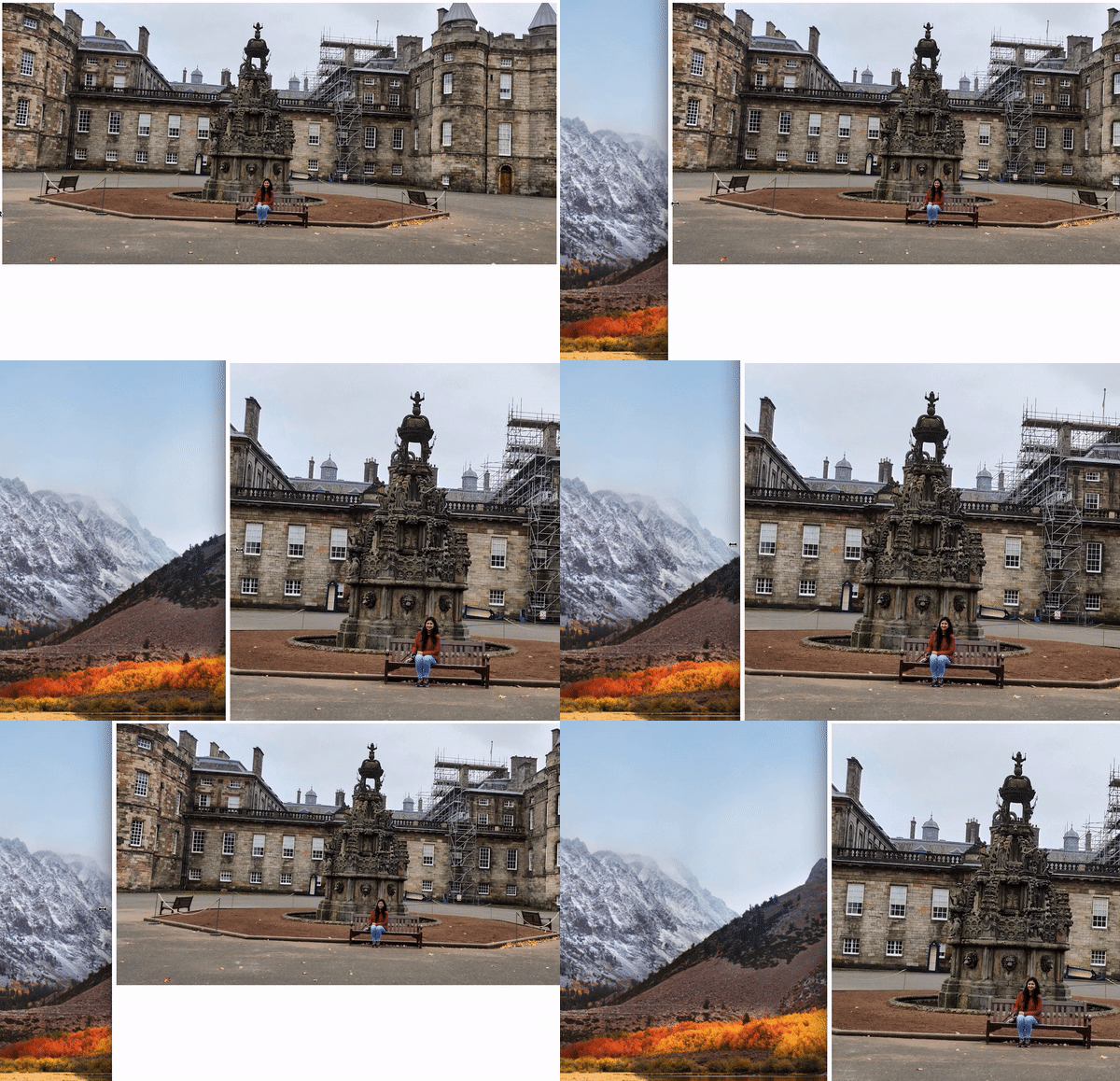
Here is a demo -

How all this was accomplished
The links to the pull requests for each of these has been given below -
-
Implementing reacting to environment changes: https://github.com/servo/servo/pull/21280
-
Implementing update the source set & reintroduction of parse a sizes attribute https://github.com/servo/servo/pull/21181
-
Implementing selecting the correct image source for different pixel densities https://github.com/servo/servo/pull/21628
-
Correcting behaviour of currentSrc https://github.com/servo/servo/pull/21533
-
Implementing all the relevant mutations: https://github.com/servo/servo/pull/21680
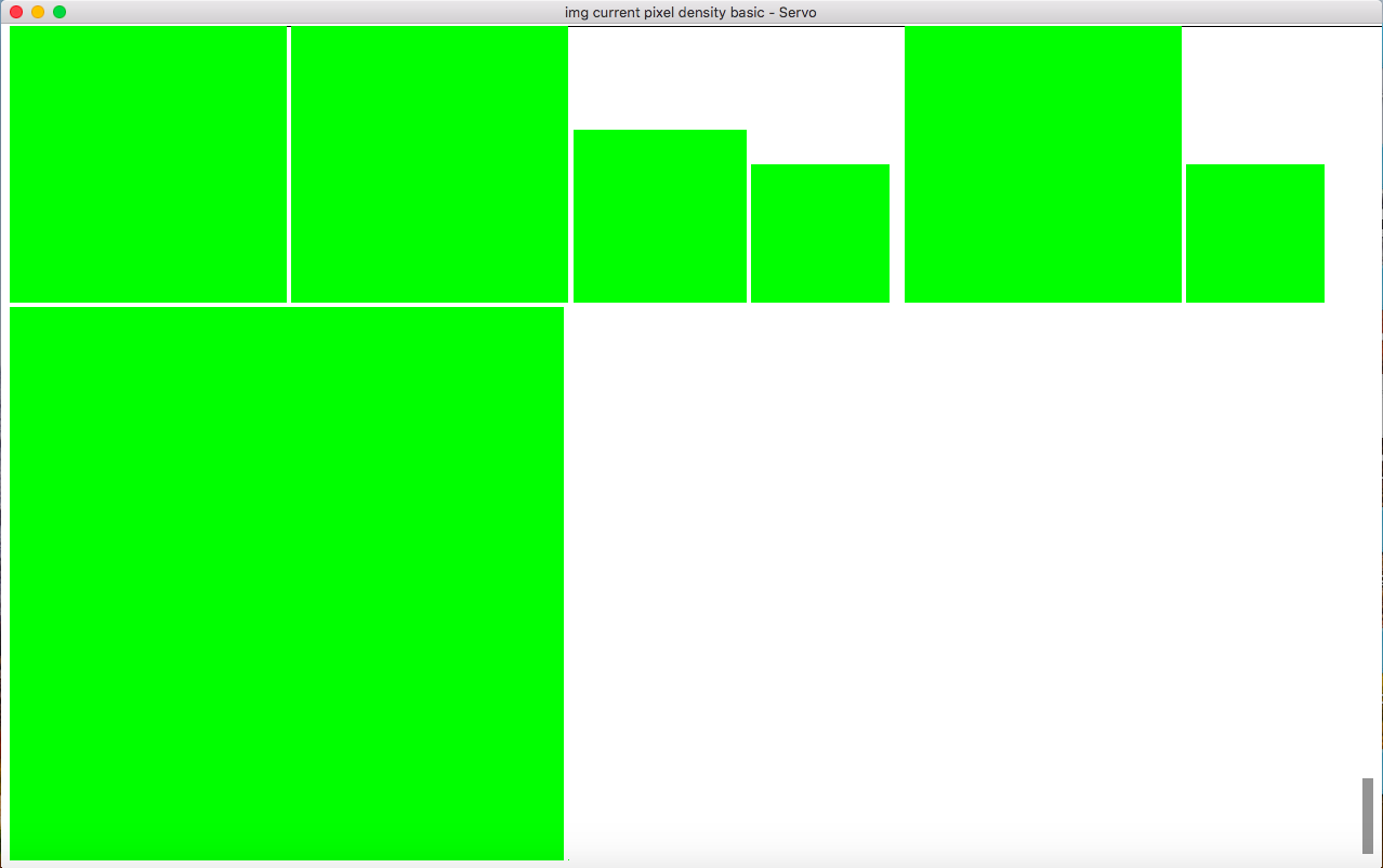
For the test - tests/wpt/web-platform-tests/html/semantics/embedded-content/the-img-element/current-pixel-density/ the below changes were seen -
In this test, there are 8 different image elements, each of which has the same green coloured square box - /images/green-256x256.png but with different x values and different sizes. So before the implementation of the code, there was a single box which could be seen. But now with passing tests, all the different sized boxes are visible.


Statistics
- In total we got 20 PR’s merged by the end of RGSoC. Approximately 10 each for the both of us. Hooray!!
- We worked on more than 5 algorithms
- Our code resulted in passing of more than 700 new tests 😮 Seems unbelievable? Go and search for the word fail at - click me!
- And finally, we wrote more than 800 new lines of code!
Future work
Some of the tests are still failing and need to be corrected. We spent a lot of time correcting the already existing tests, many of them were failing because they were intermittent tests. These are the tests which might be failing due to the timing problems. So if there are any such test which fail on the local machine and not on the remote one or vice-a-versa, it is possible that these tests are intermittent. Don’t worry about any such tests :P. Some of the timing out tests which still needs to be corrected are here - https://github.com/paavininanda/servo/blob/2de300d49cc90f6c2daf31e8ef8a7c0443eb0a94/tests/wpt/metadata/html/semantics/embedded-content/the-img-element/environment-changes/viewport-change.html.ini . Also the implementation of one of the functions i.e. matches_environment needs to be looked upon. Here is a link for it - https://github.com/servo/servo/issues/21587#issuecomment-424850214.
Conclusion
These 3 months have been really amazing for us. All that started with us being lost deep in thought about how to begin contributing to Servo has changed. We have evolved a lot and have got so closely involved with open source that we consider the community as our small family. We have loved it completely! It has been a pleasure to make some useful contributions to Servo. A huge shoutout to Josh and the whole Servo community for making it possible. Now, we feel ready to help more beginners to get started with Servo as well 🙌